I was stumped. The educators in the room were all staring up at me, waiting for me to finish my sentence. Unfortunately, my mind had blanked. I could not recall the ingredients of Flow. In that moment, it didn’t matter that I had taught game design dozens of times, to hundreds of learners all across the country. All that mattered was that flow was just a list of four ingredients – raw text. With neither an acronym, nor a visual aid to guide me, I could not bring them to mind.
Quest Accepted
That moment began my quest. I needed a better way to think about Flow. So, I spent more than two years researching, tinkering, and getting feedback on some new ideas. And finally, today, I am ready. I’m presenting the answer to my quest in a new paper for Modsim World Conference 2016.
The full paper is here: Flow Space – A Visual Guide for Flow and Simplicity in Games.
It’s not a particularly long paper, coming in under 9 pages. And even so, if you’re like me, you’d still prefer to see a cliff-notes version. So, here’s the basics.
Flow
Flow is “the state in which people are so involved in an activity that nothing else seems to matter” (Mihaly Csikszentmihalyi). It is often described as the optimal human experience of engagement. And, what’s really cool about Flow is that there’s a recipe for it. The recipe has four ingredients:
- Clear Tasks
- Immediate Feedback
- Balanced Difficulty
- Minimal Distractions
What’s less cool is that this recipe is not very easy to remember. Even after a decade of using the recipe, I still got to a point in a conversation where I couldn’t pull up the four ingredients. And maybe, it wasn’t my fault.
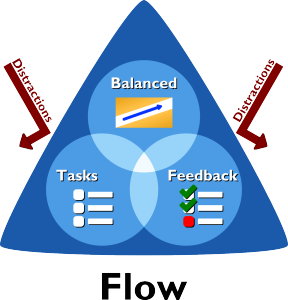
Ever heard of working memory? That’s the idea that we can typically only remember 4-7 things. It’s part of cognitive load theory and it explains what happened to me in the presentation. I was fully engaged in what I was doing, listening to each of the attendees, trying to get them all to participate. So that when the conversation swung back to flow, all of a sudden, I couldn’t remember the four ingredients. The ingredients had been swapped out to make room for other cool stuff! And, this is what often happens when we’re designing games – there are schedules, trade offs, and all the stuff that goes into the product! That’s why we need a picture, maybe something like this:
That’s what I came up with. Well, to be honest, it wasn’t the first idea I came up with. Though I’m happy with, it now. Especially considering the great feedback I’ve gotten from game development students, educators, and fellow designers. I love how this simple picture helps people focus on just one thing - they recall the image with the three circles and the triangle, and then, they can generally fill in the rest.
I found the answer to my quest!
Simplicity
And even so, I was already in this crazy frame of mind where I was thinking about diagrams, recipes, and tenets of game design. So, I turned my attention to one of my favorite topics – Simplicity.
Now simplicity is a funny word. It’s kind of vague, and also, kind of powerful. Which is probably why Leonardo da Vinci said, “Simplicity is the ultimate sophistication.” Which is pretty heavy stuff.
And what kind of stinks about simplicity is that there really isn’t a practical definition for what simplicity means in games. I mean, sure, “I know it when I see it”, except that’s not very useful. Fortunately, as I said, simplicity is one of my favorite topics. It’s something I’ve been researching for almost 5 years. And, after failing to find a recipe that already existed, I decided to create my own. So, here’s my recipe.
- Core
- Limited Choice
- Intuitive
- Player’s Perspective
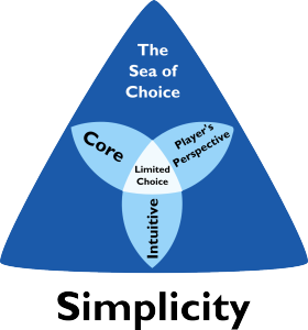
Even if it’s not a perfect recipe, at least it’s a place to start the conversation. And, in the spirit of simplicity, the ingredients spell an acronym, CLIP. Which helps remind me to clip things that don’t fit. Cute – right?
Now CLIP only takes a single slot, so I rarely have trouble remembering the ingredients, no matter how involved I am in what I’m doing. Even so, I wanted to put simplicity in a diagram too. And even more important, I wanted the pictures of simplicity and flow to be as related as the concepts themselves are. And then, finally, on a long-drive back from Pennsylvania, I came up with this.
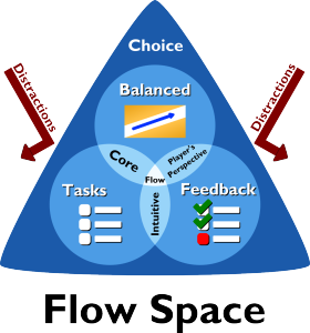
Sure, it’s not quite as cool as the Flow picture, and even so, there’s something about it that kind of works. I particularly like how similar it is to the Flow diagram – the shapes, style, and colors. And, because they are so similar, I could now combine the two diagrams into one picture, like this.
Tada! I call it Flow Space – a Visual Guide for Flow and Simplicity in Games. And, that’s the cliff notes. If you want the details, or just have 20 minutes to kill, then you might enjoy the full paper too.
Quest Complete!


